ClickFlare's dashboard has a new look, and a lot more flexibility behind it. On top of a refreshed default view with new widgets, you can now build your own dashboards from scratch, either by describing what you want to ClickFlare's AI copilot or by setting it up manually, and organize them into separate boards for different workflows.
This article is divided into two parts: the first one covers what's new on the default dashboard, and the second part explains how to create and manage your own custom boards and widgets.
Navigating the New Dashboard
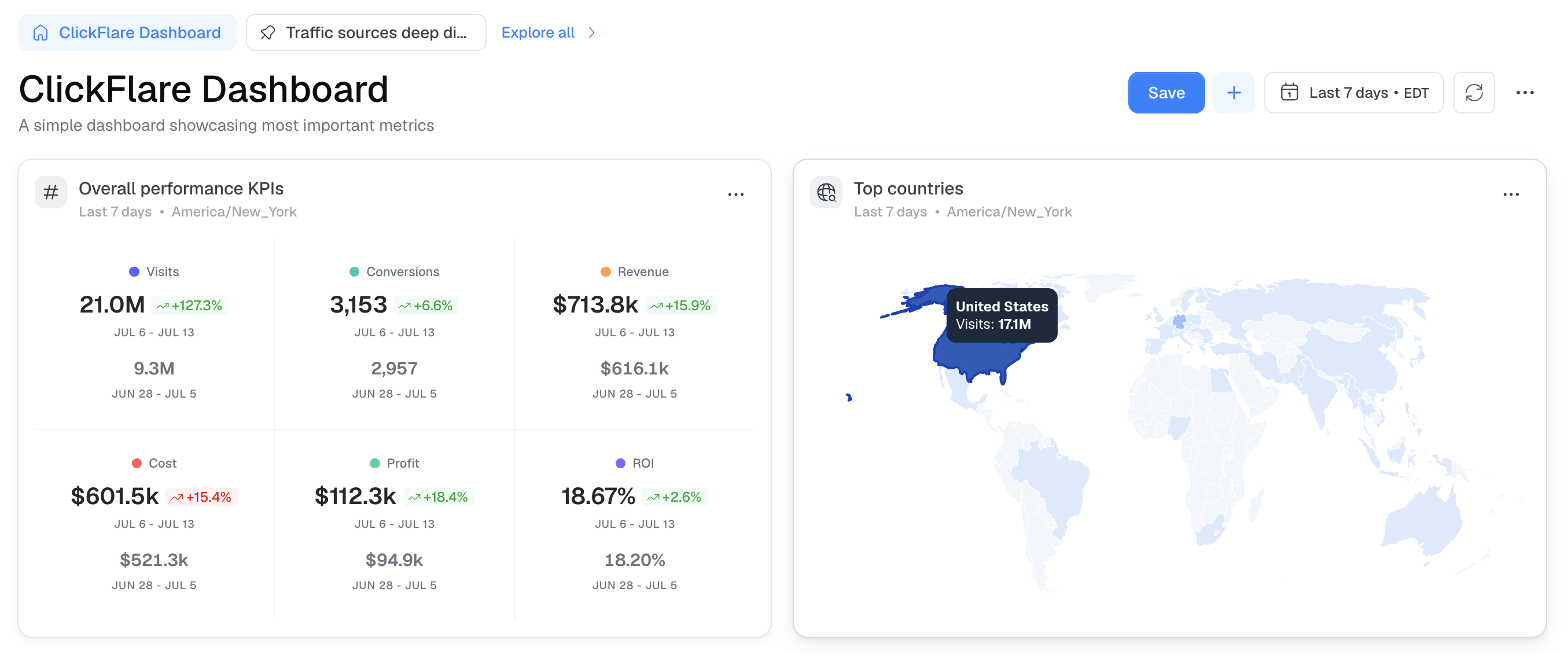
Overall Performance KPIs
The KPI tile group at the top of the dashboard now shows your core metrics, Visits, Conversions, Revenue, Cost, Profit, and ROI, alongside a trend indicator comparing the selected period to the one immediately before it. This gives you an instant read on whether performance is improving or declining, without needing to open the graph below.
💡 Reading the trend arrows: An upward arrow means the metric increased compared to the prior period; a downward arrow means it decreased. Whether that's good or bad depends on the metric itself. A rising Cost isn't a problem on its own if Revenue and Profit are rising with it.
Top Countries
To the right of the KPI tiles, a map widget shows which countries are sending you the most traffic. If you're running campaigns across several countries, this is a fast way to see where to focus your ad targeting and landing page localization.
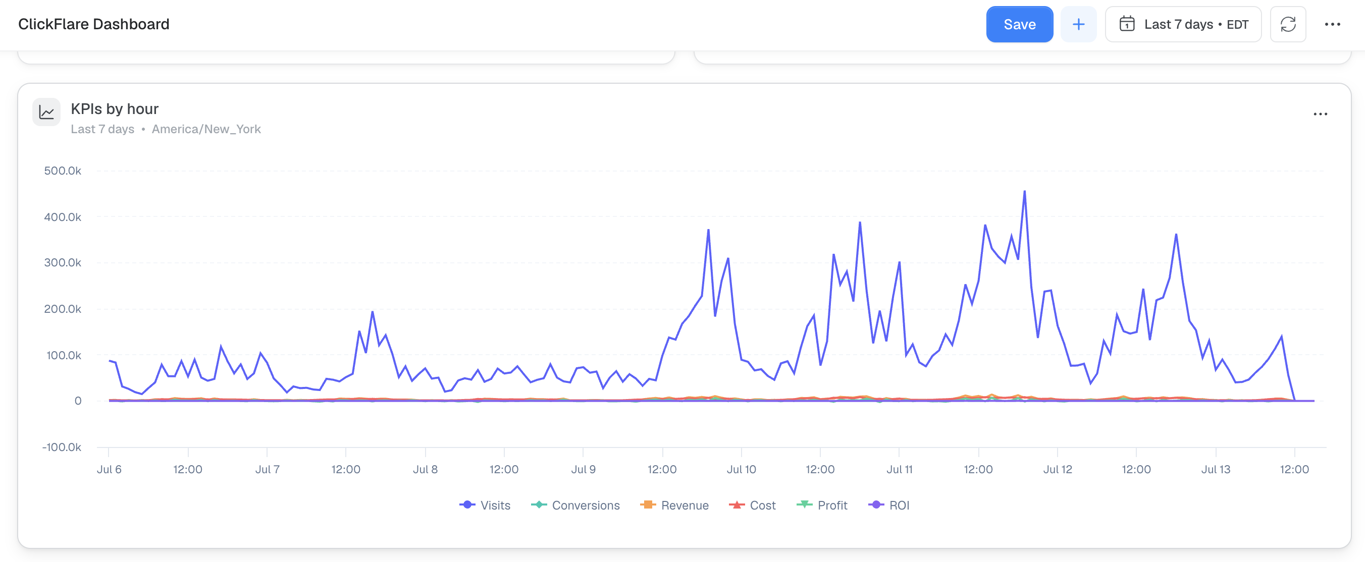
KPIs by Hour
Scrolling down, the KPIs by Hour graph breaks your performance down hour by hour instead of day by day. This makes it easier to spot whether certain hours consistently outperform others, information you can use to build or refine a dayparting strategy for your campaigns.
Top Performers Snapshot
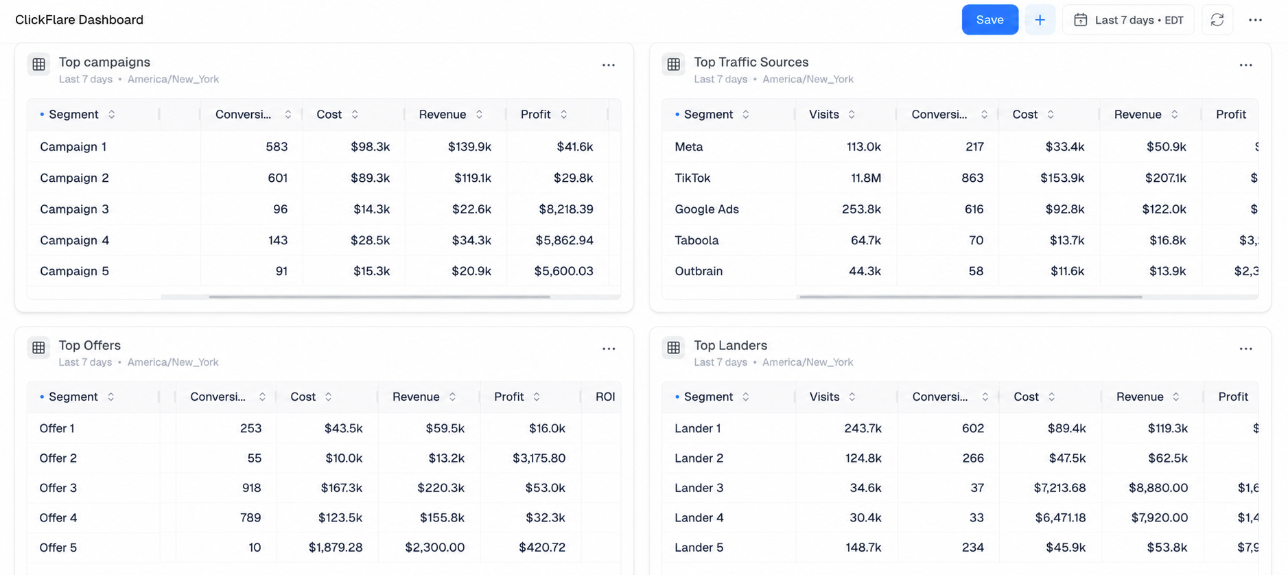
Further down, four tables give you a quick snapshot of your top Campaigns, Traffic Sources, Offers, and Landers for the selected time range. This section carries over from the previous dashboard and works the same way: each table is sorted to surface your top entries so you can quickly identify what's driving your results.
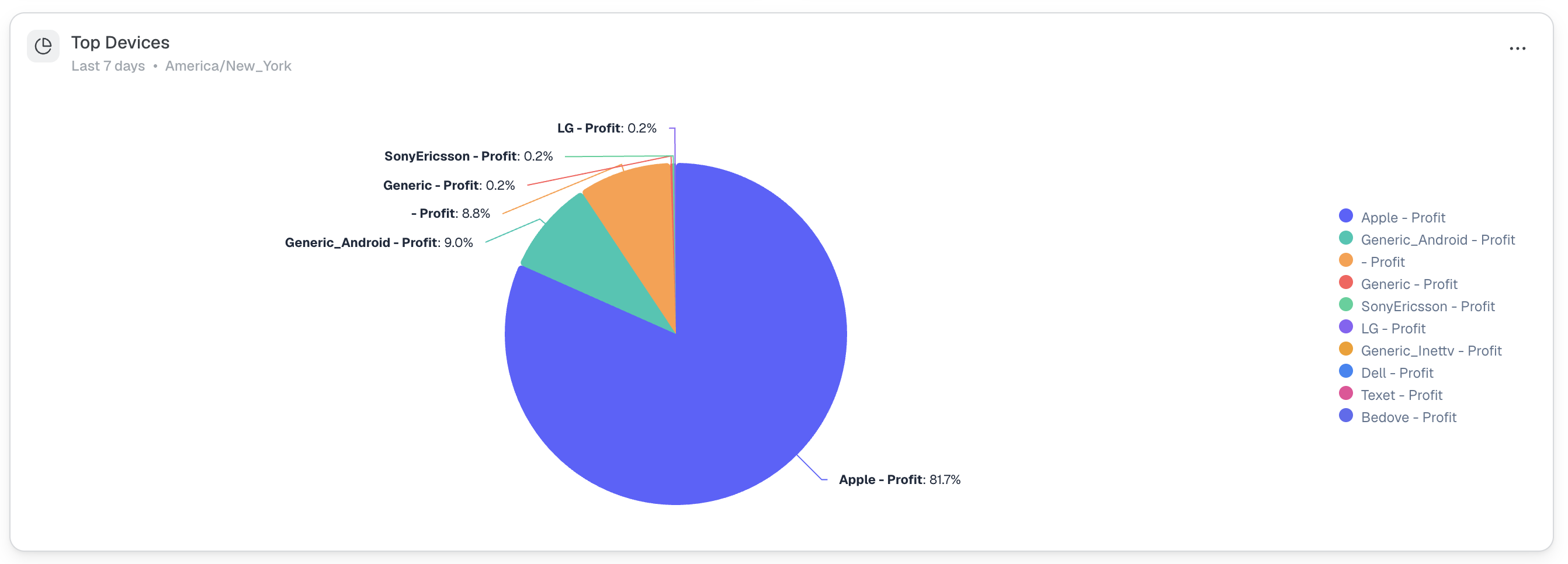
Top Devices
A new pie chart shows a visual breakdown of your traffic and performance by device. This makes it easy to see, at a glance, which device types your audience is using most, useful for deciding where to focus your creative and landing page optimization.
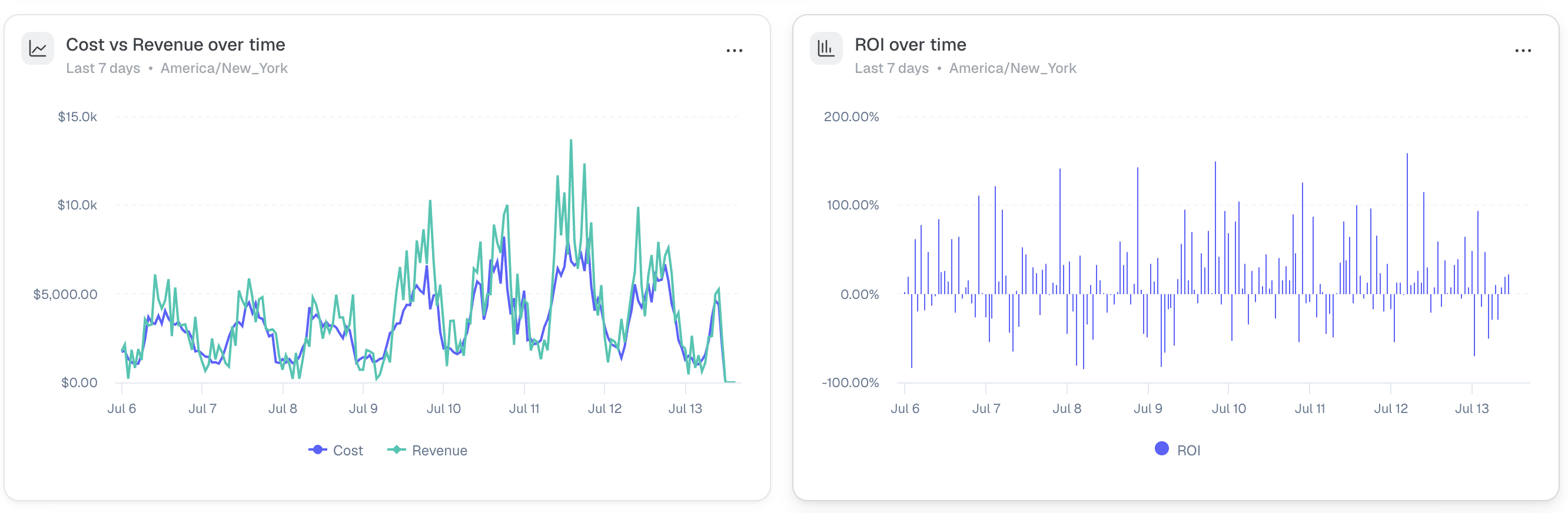
Cost vs. Revenue and ROI Over Time
Two additional graphs round out the default dashboard:
- Cost vs. Revenue over time, plotting both metrics side by side so you can see how closely they track each other as your spend scales.
- ROI over time, showing how your overall return has moved day by day, useful for spotting patterns or sudden shifts in profitability.
New Feature: Customizing and Creating Dashboards
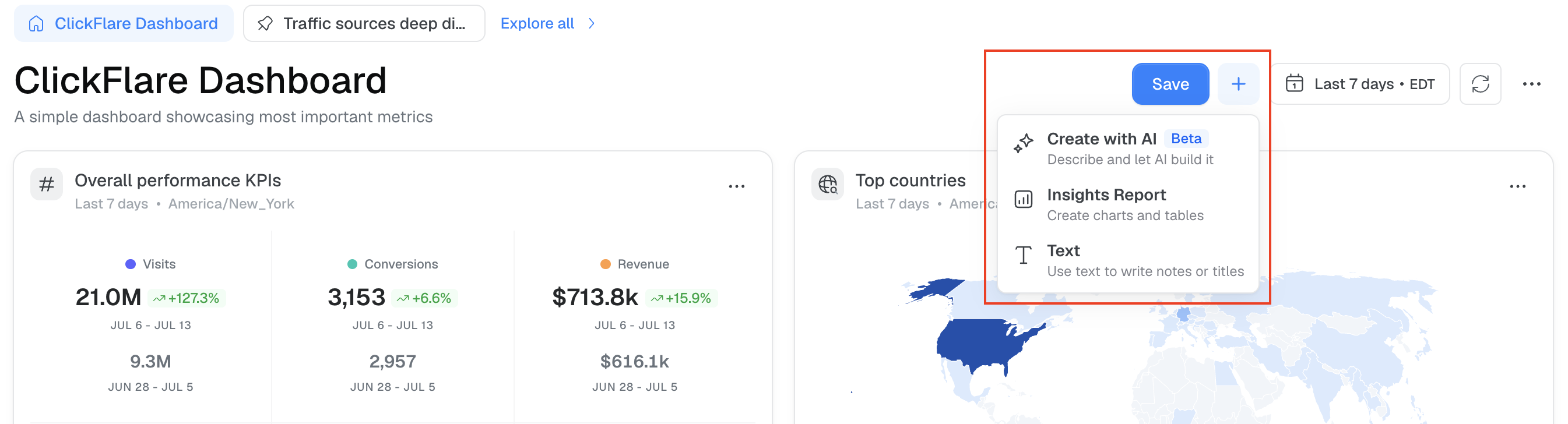
Beyond the default widgets above, you can add new widgets to any board. Click the + button next to the date selector to see your options:
- Create with AI: Describe the widget you want, and ClickFlare's AI copilot builds it for you.
- Insights Report: Build a chart or table manually by choosing your own metrics, filters, and breakdowns.
- Text: Add a notes block for context, titles, or reminders.
Creating a Widget with AI
With Create with AI, you describe the widget in plain language and the copilot builds it for you. For example, prompting it to "create a widget on this board that shows ROI by campaign" will generate that exact chart without any manual setup.
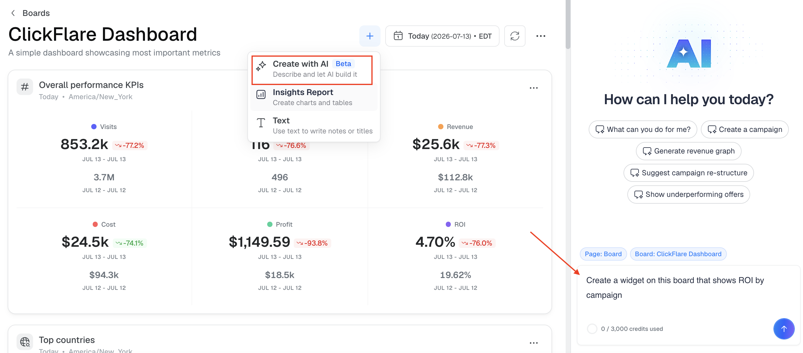
Be specific in your prompt (which metric, which breakdown, any filters you want applied) to get a more accurate result on the first try.
ℹ️ AI credits: Building widgets with AI draws from your account's AI credit allowance, shown in the AI panel when you open it.
Creating a Widget Manually with Insights Report
If you'd rather set it up yourself, click Insights Report and configure the widget in three steps:
- Metrics: Choose the metric (or metrics) you want to track. For example, ROI. You can add more than one metric to the same widget.
- Filters: Narrow the data down to what you actually want to see. For example, filtering to only your top three campaigns.
- Breakdowns: Choose what the widget compares. For example, breaking the data down by Campaigns will plot a separate line for each one.
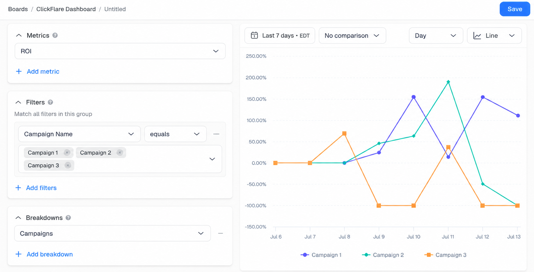
You can also set the time range, comparison period, granularity (hourly, daily, and so on), and chart type (line, bar, and others) from the toolbar above the preview before saving.
Once you're happy with the preview, click Save to add the widget to your board.
Adding Notes
Click Text to add a notes block to your board. This is useful for leaving context for yourself or your team, such as notes about a specific campaign or a reminder about what a board is tracking. Text blocks appear at the bottom of the dashboard view.

Creating Additional Boards
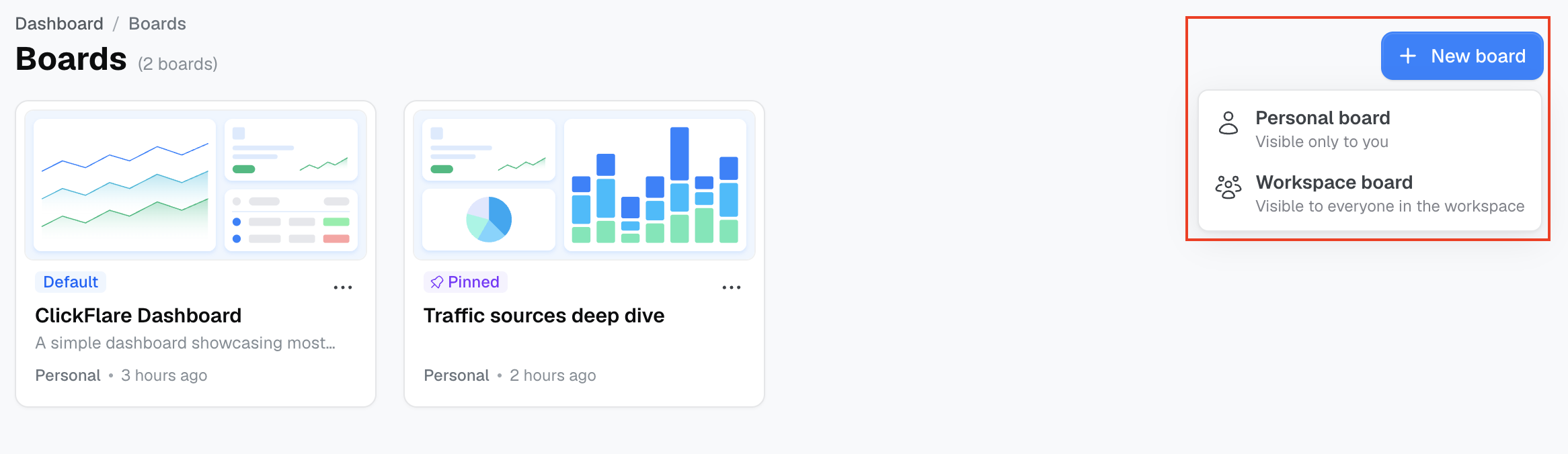
Beyond customizing your default dashboard, you can create entirely new boards for different use cases. Click New board and choose between:
- Personal board: Visible only to you.
- Workspace board: Visible to everyone in the selected workspace.
Boards you use often can be pinned from the Boards list so they stay easy to find.
Example: Traffic Sources Deep Dive
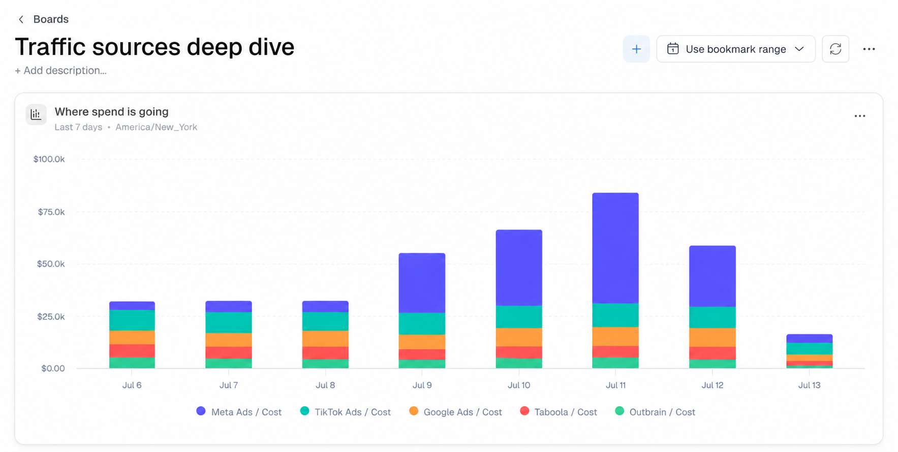
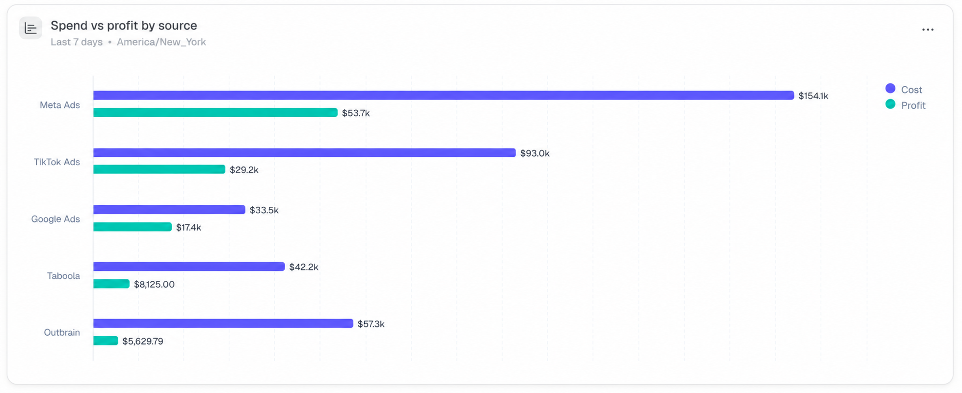
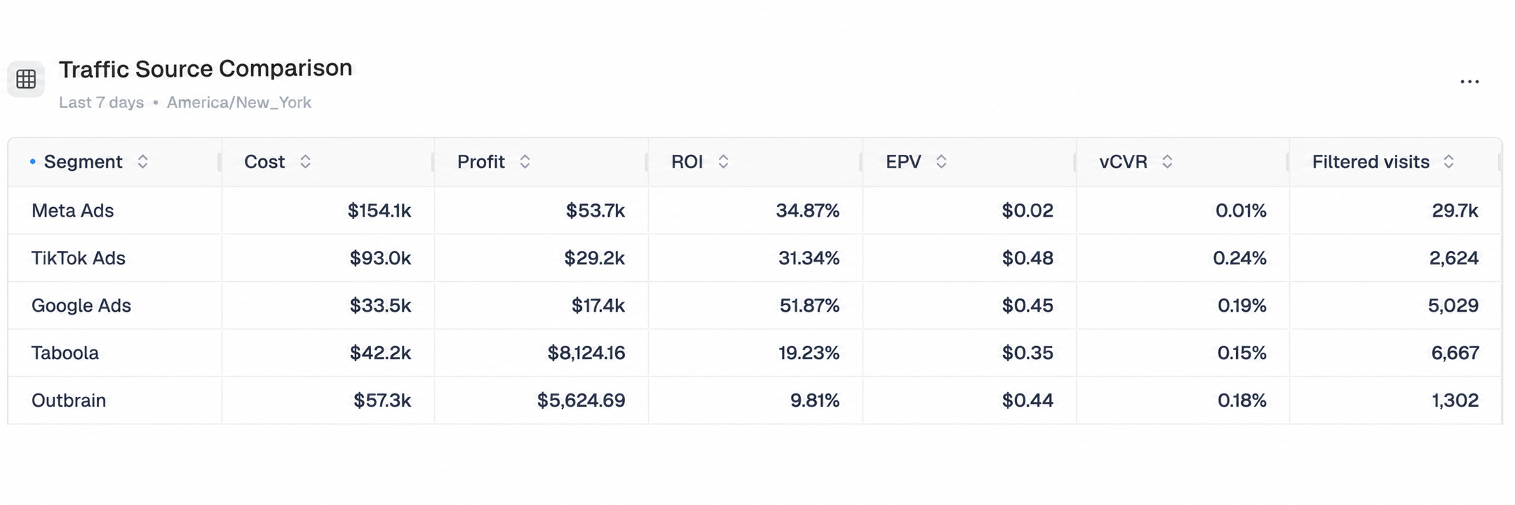
One example of a purpose-built board is Traffic Sources Deep Dive, useful if you're running traffic across more than one ad network. It includes:
- Where spend is going: A stacked bar chart showing daily ad spend broken down by traffic source, so you can see which source is consuming the most budget on a given day.
- Spend vs. profit by source: A bar chart comparing cost and profit side by side for each traffic source, useful for deciding where to shift budget.
- Traffic Source Comparison: A table breaking down key metrics (including Cost, Profit, ROI, EPV, and vCVR) by traffic source, so you can compare performance across platforms at a glance.
FREQUENTLY ASKED QUESTIONS
Q1: What's the difference between a personal board and a workspace board?
A1: A personal board is visible only to you. A workspace board is visible to everyone in that workspace, which makes it useful for sharing a consistent view across your team.
Q2: Is this feature available on my plan?
A2: Yes. Custom widgets and boards are live on all ClickFlare plans.
Q3: What's the difference between using AI and using Insights Report to build a widget?
A3: Create with AI lets you describe the widget you want in a prompt and have the copilot build it automatically. Insights Report gives you the same result but through manual controls, where you choose the metrics, filters, and breakdowns yourself. Use whichever fits how you like to work; both add the finished widget to your board.
Q4: Can a single widget track more than one metric?
A4: Yes. When building a widget with Insights Report, you can add multiple metrics to the same widget rather than creating a separate one for each.
Q5: Where do Text notes show up on my board?
A5: Text blocks appear at the bottom of the dashboard view, below your other widgets.
